Contours and crags
Contents: Contours and crags
NASA/SRTM contours
• Accuracy and height files
• Filling the voids
• ViewfinderPanoramas.org
OSM crag markings
OS Opendata
NASA/SRTM contours
Although OpenStreetMap doesn’t hold contour data, OpenStreetMap topo maps do contain contours. Often those contours are thanks to NASA. If the map-provider doesn’t mention where the contours have come from then the map very likely uses these NASA contours. They are less accurate than the contours on a 1:50k OS map.
‘NASA’ contours or ‘SRTM’ contours (same thing) may be mentioned on OSM-based topo map download sites without any more clues as to what their limitations might be. Here’s a bit more information…
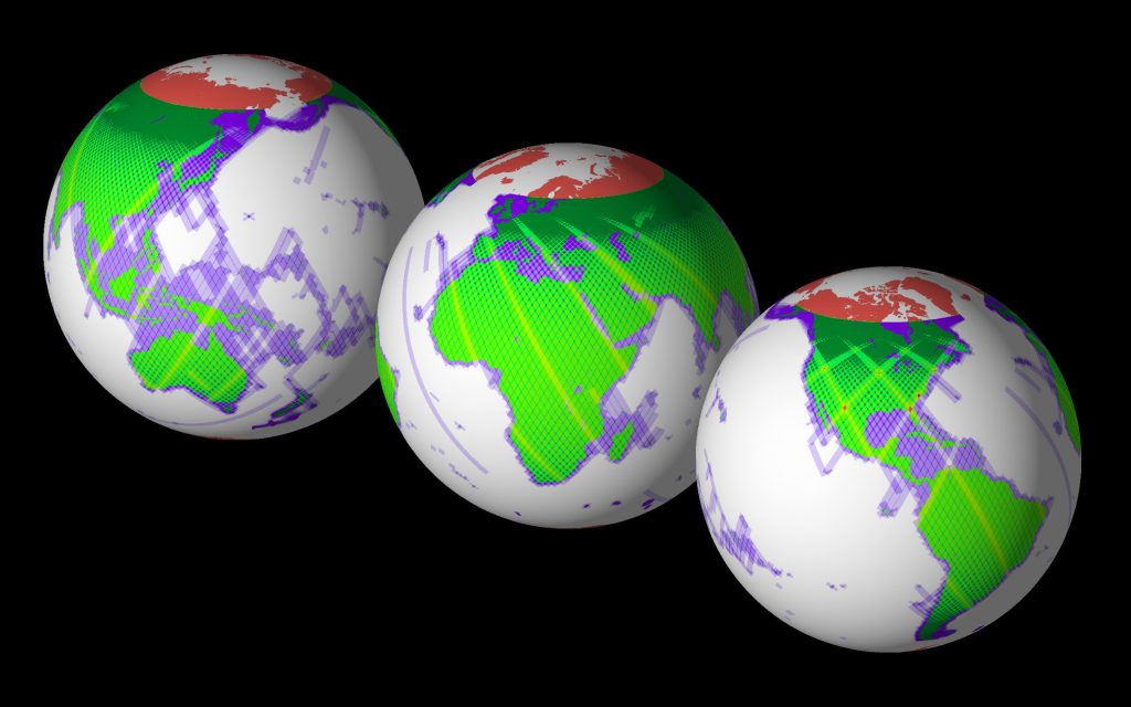
In 2000, for eleven days, NASA used the Space Shuttle to survey most of the planet and collect detailed land elevation data. The technique used could ‘see’ through clouds (radar interferometry) and the project was called the Shuttle Radar Topography Mission. This is where ‘SRTM’ comes from.
They didn’t survey Antarctica or anything north of the Shetland Islands but 95% of the planet’s population live in the surveyed area. In 2015 NASA made the collected data freely available and free to use.
Accuracy and height files
NASA’s most recent free data issue is based on data which has a resolution of about 30m (at the equator). A useful analogy is to imagine a regular grid projected onto the ground. Viewed from space the grid would appear as 30m squares and height would be measured at the corners of the squares. A pretty good model of the terrain results.
The SRTM mission objective was horizontal accuracy of better than ±20m and maximum height errors of ±16m.
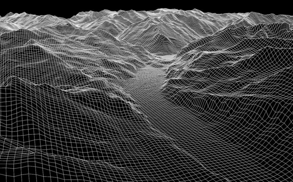
Although the data was collected with a 30m resolution, NASA say the resolution of the publicly available data is about 295 feet (90m), at the Earth’s equator. That’s not nearly as good as the OS contours we see on the Landranger and Explorer mapping and means that large dangerous features might not show up in the contours.
NASA’s data is available as thousands of ‘height’ files. Each file covers an area on the earths surface that’s 1 degree of latitude by 1 degree of longitude. Click the picture below, or see the more detailed online version, to see how the surveyed area is divided up.
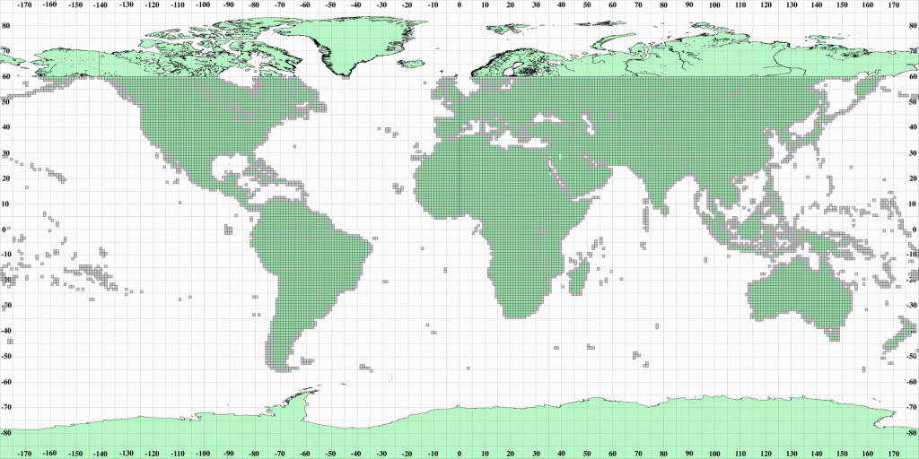
Normally these files get downloaded into a folder invisibly by a phone app but you might come across them whilst browsing your phone’s folders. The filenames define which area the file is for and all have a ‘.hgt’ suffix.
eg N42W101.hgt. includes data for latitudes 42 to 43 North and longitudes 101 to 102 West. If you take a good look at the picture above, you should find that in the middle of the USA.
These files are also called DEM files – ‘digital elevation model’. Each ‘hgt/DEM’ file contains a long list of spot heights arranged in a grid. They allow accurate contours to be generated.
Filling the voids
The original NASA data has some areas where the shuttle struggled to get good information. Those areas are known as ‘voids’ and include spots in places like the Himalayas where the ground is high and steep. So, other sources of good contour data have been used to augment NASA’s work and ‘fill in the gaps’. Map makers can use these official void-filled versions of the NASA data freely.
ViewfinderPanoramas.org
Jonathan de Ferranti of ViewfinderPanoramas.org has drawn on many publicly available data sources to further improve the official void-filled NASA data. His work may be freely downloaded via his map at ViewfinderPanoramas. Each little tile will download all the .hgt files for that area.
This might be the best source of freely available elevation data for the globe. Consequently some good navigation apps download these files directly (eg Locus Map, Oruxmaps, Alpine Quest and Cartograph Maps) so they can provide things like a hillshading overlay, altitude information, 3D views of the maps, route elevation profiles and more.
If you want fine control over the files, you can download the files yourself manually and place them in the appropriate folder in an app like Locus Map 4.
NASA’s free data can’t model smaller features. Dangerous cliffs might not show in the OSM map contours and rugged ground gets significantly ‘smoothed out’. That difference in contour detail between OS and SRTM contours is apparent in the maps and becomes most obvious in steep craggy areas. See the Ben Nevis extracts next…
OSM crag markings
Although OSM maps are accurate, in mountainous areas the recorded detail is currently not as good as in high quality OS-type topo maps.
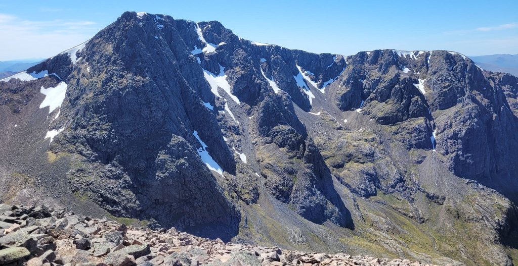
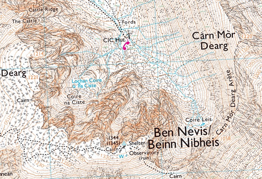
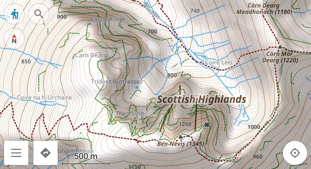
The following four maps all show the steep north face of Ben Nevis pictured above. They illustrate typical differences between a 100% OSM topographic map using NASA contours and the Ordnance survey 1:25k Explorer and 1:50k Landranger maps.
On the 1:25k OS map, crags, scree, rocks and grassy areas are all marked. It’s clear that the ridges running up either side of the summit will not provide easy walking. Notice how tightly the contours turn around the rocky ridges. With a 10m contour interval, it’s just the practicalities of printing at this scale that limits what’s shown.
The web-based OpenTopoMap shows 10m vertical interval contours. However the publicly available NASA data has a much coarser resolution (90m). The 10m contours can only be extrapolations from the source data and although that might help judge slope steepness, they can’t detail the terrain like the better OS contours. Notice that the OSM contours don’t make tight turns around the crags. The OS contours do. The shading warns of difficult terrain but it’s not apparent just how tricky the ground is.
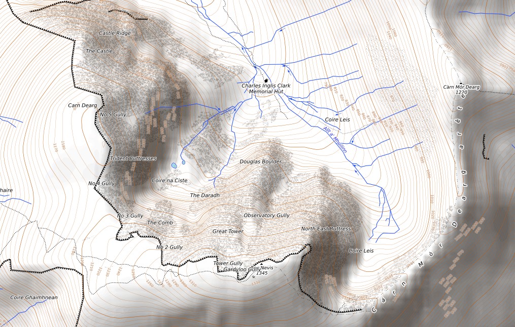
Different OSM vector maps display the OSM crag data in slightly different ways. Sometimes ‘bumpy’ or ‘jagged’ lines will just mark the cliff edges and at other times many crag-lines are used to better represent a craggy area. In the OpenTopoMap above, only the cliff edge around the summit plateau is clearly marked.
OsmAnd is a phone app that specialises in OSM mapping. It shows more of the OSM crag markings and has better contour detail than the OpenTopoMap but it can’t compete with a good 1:25k OS map.
The 1:50k OS map represents the craggy terrain much better than some free OSM maps. Hopefully the future will bring further improvements to OSM mapping of craggy hills.
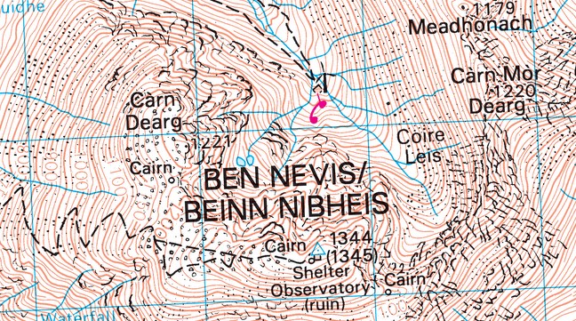
If you’re navigating a route over easy ground, then a map which is 100% OSM with NASA contours will do the job. However, if your route goes through or near craggy terrain then plan your route using a map that has better contour and crag detail.
OS OpenData
Here in the UK we have access to free or cheap mapping which combines OpenStreetMap data with OS OpenData. That free Ordnance Survey OpenData includes OS ‘Terrain 50’ contours which are better than the NASA contours. Much of the same excellent crag detail that we find on the OS 1:25k Explorer mapping is also part of that OpenData.
OS/OSM hybrid maps are a good choice if you spend time in places like Snowdonia, the Lake District or the highlands of Scotland. You can enjoy good terrain modelling from the OS as well as see useful extra details from OSM, on the same map.
In Scotland particularly, many of the good paths on the high ground are not marked on the OS maps. A hybrid map that shows those extra paths and still includes the OS crag detail is very useful.
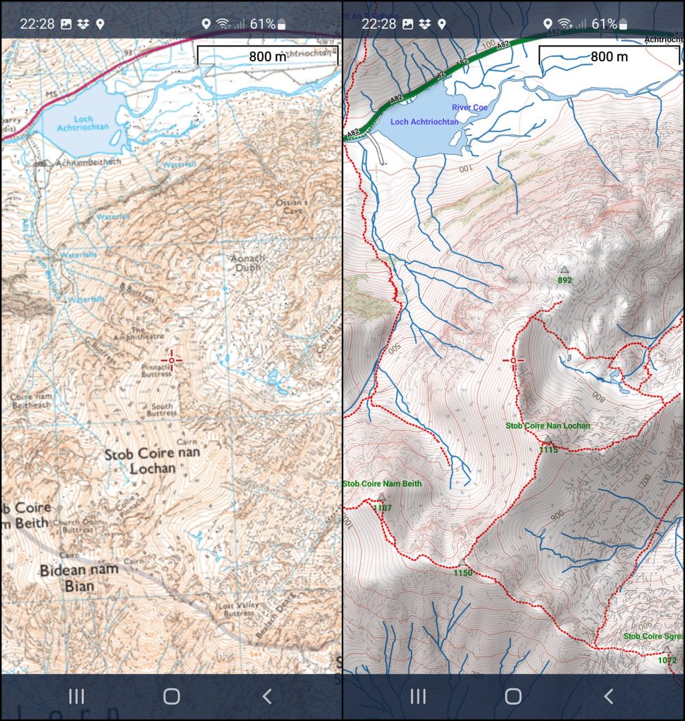
The WayMaps at WalkLakes.co.uk, OpenAndroMaps and the John Thorn map all include that OS OpenData crag detail. The WayMaps and John Thorn Map already use the OpenData ‘Terrain 50’ contours. OpenAndroMaps plan to transition to OS ‘Terrain 50’ contours soon (Jan 23).
Many other OSM-based maps of the UK will be using the lower resolution NASA contours. If you’re using a navigation app that’s not using OS maps then pick some steep craggy areas, zoom-in and compare the contours & crags on your map with the 1:25k OS maps to learn how much worse they are.
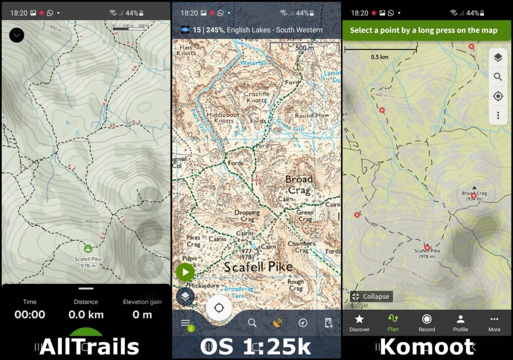
I haven’t dug into the tech specs of the OS ‘Terrain 50’ contours but I have compared them with the OS contours on the usual OS mapping. ‘Terrain 50’ contours look slightly less detailed than the contours found on an OS 1:50k Landranger map. However they are similar enough that I doubt you’d notice unless looking closely.
In more rugged terrain, contours don’t tell the whole story. Having a map which also does a good job of marking the crags is a much better map.
If you are in the UK and exploring mountainous terrain, then a map with OS contours and crag markings is a good choice.
